Theming
Splash Screen
Flutter's Adding a Splash Screen to Your Mobile App documentation provides the most up-to-date and in-depth guidance on customizing the splash screen in your mobile app.
Android
Within the android/app/src/main/res folder, replace launch_image.png inside the
mipmap-mdpimipmap-hdpimipmap-xhdpimipmap-xxhdpi
folders with the image asset you want featured on your Android splash screen. The launch_image.png you provide inside the mipmap folders should have an appropriate size for that folder.
The background color of your splash screen can be changed by editing the hex code value with name="splash_background" in android/app/src/main/res/values/colors.xml.
iOS
You should configure your iOS splash screen using an Xcode storyboard. To begin, add your splash screen image assets named
LaunchImage.pngLaunchImage@2x.pngLaunchImage@3x.png
with sizes corresponding to the filename inside the ios/Runner/Assets.xcassets/LaunchImage.imageset folder.
Open your project's ios folder in Xcode and open Runner/LaunchScreen.storyboard in the editor. Specify your desired splash screen image and background by selecting those elements and editing their properties in the Xcode inspectors window. Feel free to further edit the splash screen properties in the Xcode inspectors window to customize the exact look of your splash screen.
App Launcher Icon
You can use the Flutter Launcher Icons package to streamline adding your new app launcher icon.
Alternatively, you may want to manually update your app's launcher icon. Flutter's documentation contains information on how to accomplish this for both iOS and Android.
App Logo
App logo image assets are displayed at both the top of the feed view and at the top of the app navigation drawer. To replace these with your custom assets, replace the following files:
packages/app_ui/assets/images/logo_dark.pngpackages/app_ui/assets/images/logo_light.png
Change the dimensions specified in the AppLogo widget (packages/app_ui/lib/src/widgets/app_logo.dart) to match your new image dimensions.
App Colors
The colors used throughout your app are specified in the app_colors.dart file found in packages/app_ui/lib/src/colors. Add custom colors to this file and reference them as an attribute of the AppColors class inside your app (e.g. AppColors.orange). The role of colors within your app can be specified as either theme information or as an inline color.
Theme Colors
Some colors are assigned to themes, which allow colors to be shared throughout your app based on their intended role in the user interface. For additional information on specifying theme colors, reference the Flutter Use Themes to Share Colors and Font Styles cookbook.
App themes are laid out in the app_theme.dart file inside the packages/app_ui/lib/src/theme folder. For example, the widget-specific theme _appBarTheme allow you to specify the colors and theme information for your AppBar.
In-line Colors
Not all of your desired color assignments can be specified by changing the app's theme data. You may want to use a color only on certain instances of a widget or specify colors with more granularity than the theme information supports. There are several existing inline color specifications in your app:
Specifying Button Colors
The colors of an app button are specified by the named constructors laid out in packages/app_ui/lib/src/widgets/app_button.dart. To specify new button colors, create a new color constructor. For example, to create an orange app button create the constructor
const AppButton.orange({
  Key? key,
  VoidCallback? onPressed,
  double? elevation,
  TextStyle? textStyle,
  required Widget child,
}) : this._(
        key: key,
        onPressed: onPressed,
        buttonColor: AppColors.orange,
        child: child,
        foregroundColor: AppColors.white,
        elevation: elevation,
        textStyle: textStyle,
     );
You can then call the new AppButton.orange constructor in your app wherever you want to add an orange button, or replace an existing constructor call such as AppButton.redWine with your new constructor to update the button color.
Specifying TabBar Colors
The TabBarTheme specified in app_theme.dart does not provide a backgroundColor property. To specify a specific color for the CategoriesTabBar rendered below the AppBar, edit CategoriesTabBar's build() method inside lib/categories/widgets/categories_tab_bar.dart to place the TabBar widget inside a ColoredBox:
return ColoredBox(
  color: AppColors.orange,
  child: TabBar(
    controller: controller,
    isScrollable: true,
    tabs: tabs,
  ),
);
Other widgets with in-line specified colors include:
PostContentPremiumCategorySlideshowCategoryPostContentCategoryMagicLinkPromptSubtitleManageSubscriptionViewAppTextFieldArticleIntroduction
Typography
Fonts
For general details regarding font customization, reference Flutter's Use a Custom Font documentation.
To change the fonts used in your app, first add your font assets inside packages/app_ui/assets/fonts, then list the added fonts under the fonts section of packages/app_ui/pubspec.yaml.
You can specify which fonts you want used in different elements of your app in the packages/app_ui/lib/src/typography/app_text_styles.dart file.
You can specify the fonts used in your app by changing the fontFamily value at the following locations inside the app_text_styles.dart file to match the name of your desired font family:
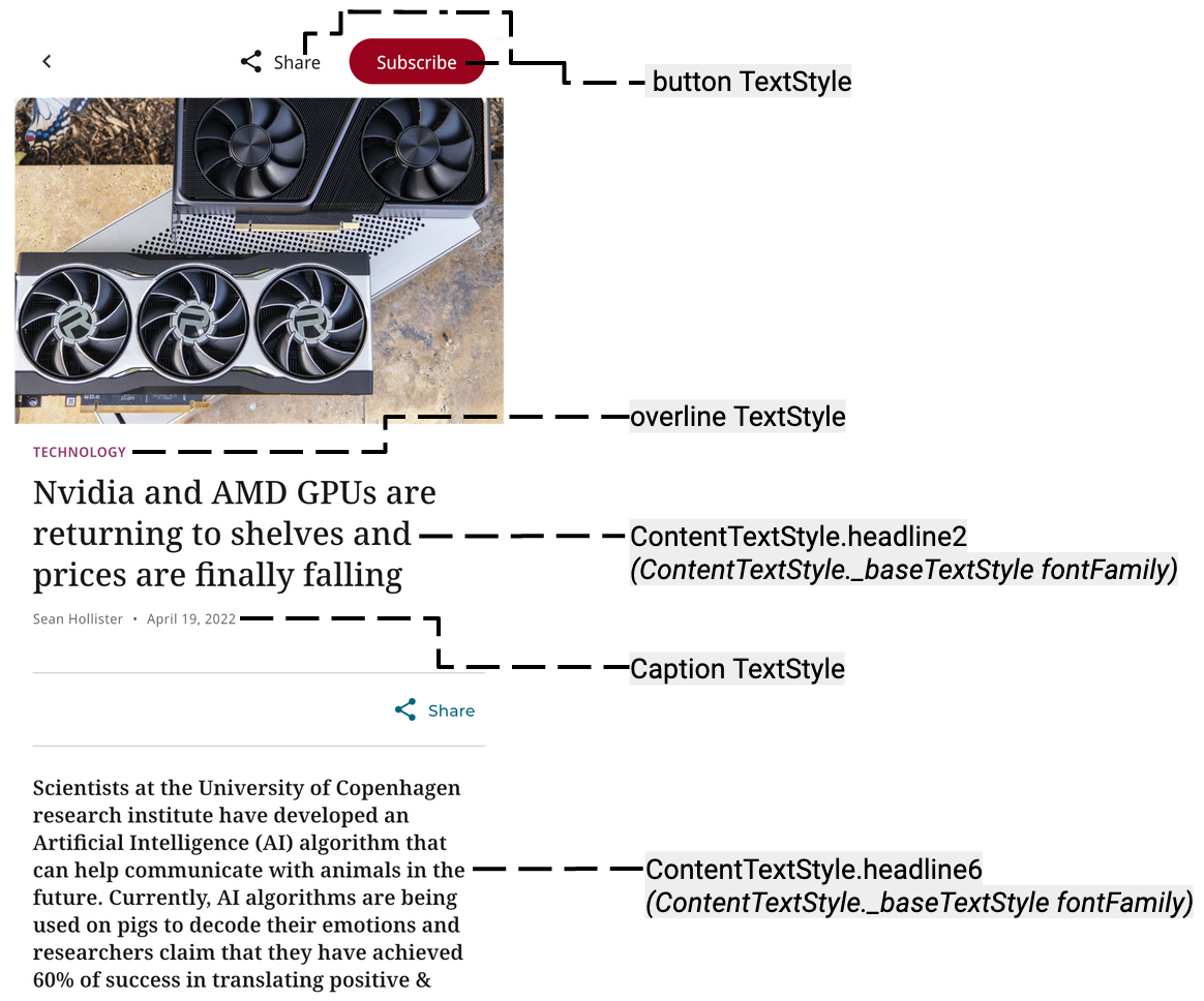
UITextStyle._baseTextStyle- Specifies the default font used in UI elements.
ContentTextStyle._baseTextStyle- Specifies the default font used in news content.
button- Specifies the font used in buttons.
caption- Specifies the font used in your caption text.
overline- Specifies the font used in overline text elements such as category labels.
labelSmall- Specifies the font used in label text (not referenced in the template out-of-the-box).
Additional Customization
To customize your app's typography further, you can add and edit various TextStyle values, such as fontWeight, fontSize, and others in the packages/app_ui/lib/src/typography/app_text_styles.dart file.
The correspondence between selected TextStyles and visual elements in the app is illustrated below.
For styling text contained in HtmlBlocks, you can edit the style map in packages/news_blocks_ui/lib/src/html.dart to associate HTML selectors with the TextStyle you want to be utilized when the HTML is rendered.
Text Style Visualization